


Designing our living room with Transition State
A behind-the-scenes reflection with LA interior designer Jenna Rochon

Welcome to Part 2 of a design discussion with interior designer and co-founder of LA-based Transition State, Jenna Rochon. If you want to catch up on part 1 to learn more about Jenna, click here. For this post, my goal was to dissect the process of creating a space to love over the long term. We decided to talk about the design process for my living room because it was the room where our vision was strong from an inspiration standpoint, but not fully formed when it came to clearly articulating the end result. Our living room was finished by the Transition State team ~2 years ago, and we are still so incredibly in love with every single piece and “vignette moment” created - it feels timeless, organic, and authentically us. Walking down the stairs in the morning and into our living room puts me in a peaceful and happy state as I see the rays of sunshine stream in through the window and dance across the diverse surfaces in the room.
Here’s Jenna’s and my trip down [relatively recent] memory lane.
JZ: Let’s talk about the inspiration for the room and where we started with our initial conversations upon meeting.
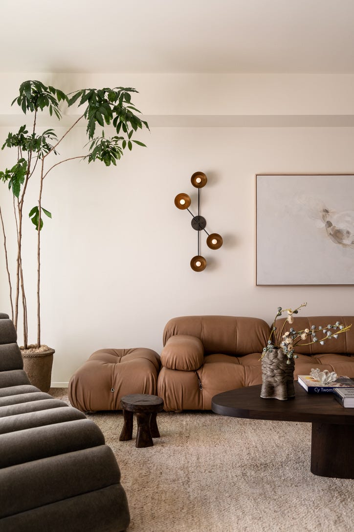
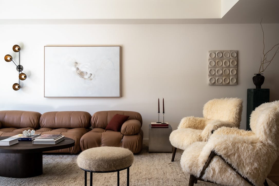
JR: Ohh I love this living room! With most designs I start with the client’s desired “feeling” - that is the most important question in my opinion. I then layer in functionality; however feeling is crucial because I feel strongly spaces need to reflect the end user and be a place to create a life you love, and provide a place to rest and recharge. This living room started with you and your love of the desert - specifically Palm Springs and Joshua Tree - and art and design. It started with the iconic Mario Bellini sofa and from there we knew we wanted an artful space but also a warm, welcoming environment to entertain and relax. This entire house was artful and while inspired by the desert we still wanted to reflect a California design - which we did so in many of the artists featured. Almost every piece has a story, which is really fun for design lovers!
JZ: We knew from the beginning that our color palette would be inspired by the natural beauty of our many hikes throughout the desert. The more muted and organic tones of brown and green from rock formations and cacti always struck us as harmonious. Every time we would hike our favorite trail and reach the summit, I would say that someday my goal was to have a home in these colors. The other place we drew inspiration from was the Kelly Wearstler-designed Santa Monica Proper Hotel. We watched the build of the property as locals and were enamored by the artful, gallery-like way oceanside living was captured and interpreted through the originality of each statement piece.
JZ: The core pieces really anchored us. Let’s talk about how we built around them.
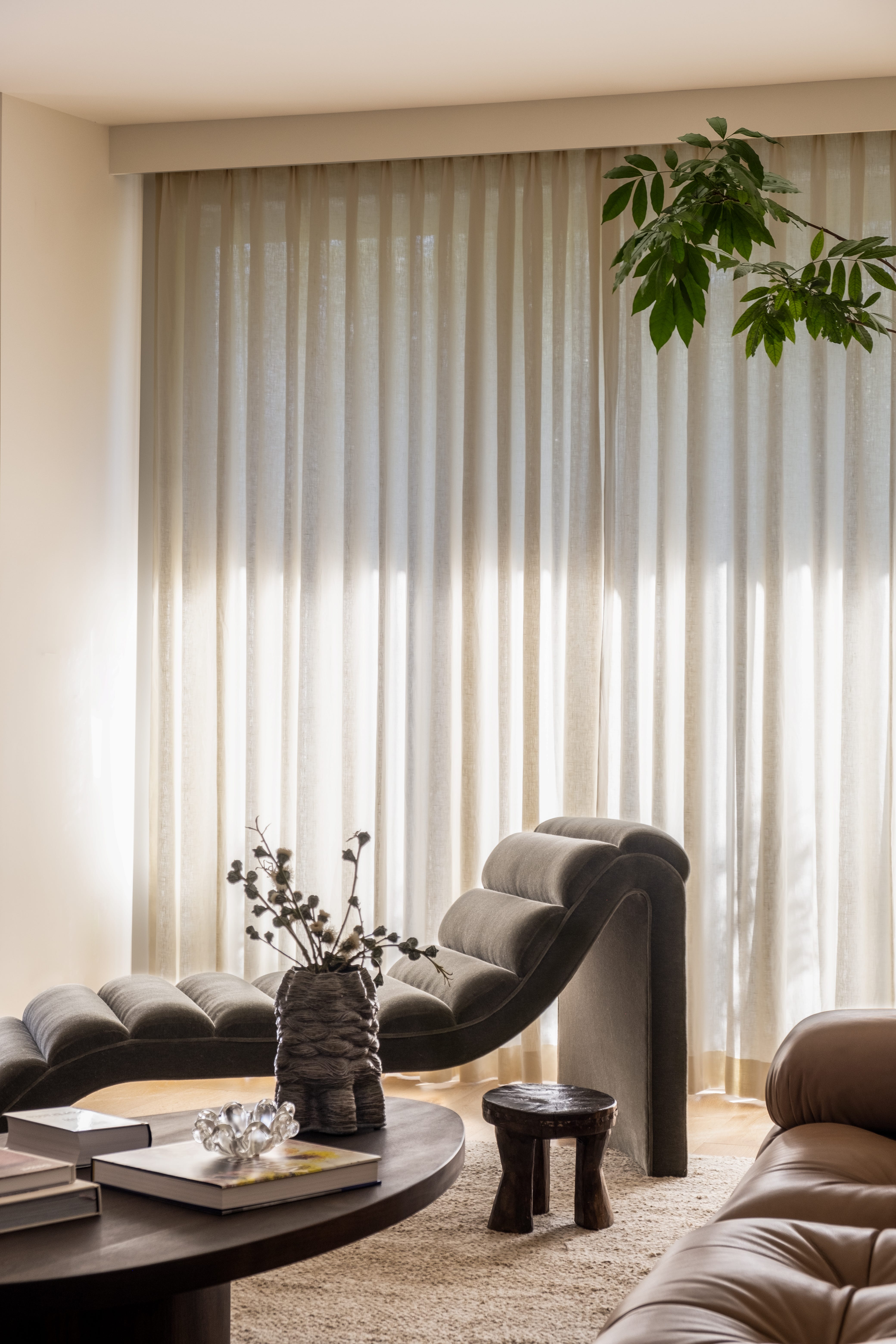
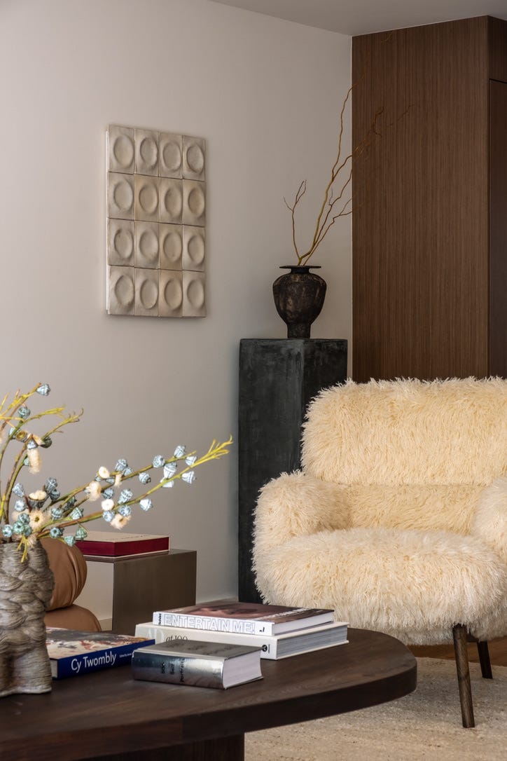
JR: As we know, the Mario Bellini began this process but every other piece was selected and a large majority was custom designed as additional statement pieces! They can all stand alone but also speak to each other and support the Bellini, which was our goal. For example, the coffee table we designed was a custom organic shape to offset the rectilinear line of the sofa but build on the rounded edges from the sofa tufting. The vintage-inspired chaise had these beautiful, deep channels and underside curve built off of the softer lines throughout. Finally it was the chairs - which if anyone knew how many chairs and how many fabrics we looked at to get it just right they would understand why they are the most epic chairs in our eyes - the profile with the texture feels like a “hug” when sitting in them! And they are just as much of a “wow” to the sofa wow.
JZ: I once worked in the modern furniture space, partnering with iconic companies that own the rights to some of the most famous designs in the world. During my time in that role, I gained a deep appreciation for the stories behind the designs - from the trends of the time, economic conditions - which often played a big part in the designs themselves, and how the furniture creator was inspired. I fell in love with the Bellini long ago, loving the curves, tufting, and chrome pieces at the puckering. The versatility of the shape always makes for great conversation around the intersection of beauty and functionality.
As Jenna mentioned, we wanted so many of the additional pieces to be statements in themselves, but not feel like the pieces were in competition. Jenna has experience building and designing furniture pieces, so when we were out and about in LA and on trips, I would send photos of shapes and furniture pieces that had elements I loved. She then made that come to life! Oh and the chairs - we did look at potentially every modern chair on the internet - dare I say? And the end result are these shaggy, welcoming, yeti-like chairs with contrasting, dainty and grainy wooden legs.
JZ: I learned so much from Transition State when it came to textures, materials, and effortless mixing and matching.
JR: In designing it's then about the layers that make it feel like a home. The color palette was inspired by the dusty tones of the desert while creating a few higher contrast items to not have the entire space on one note. Texture was huge as you can see in the accent chairs among other pieces. We played with leathers, mohair, high pile fabrics, linen, etc. as well as mixing of wood tones and metals to create a curated space. One of my favorite pieces was the add at the end of a CB2 simple chrome end table, a nice high / low mix or what I call the supporting actor in the space. Lastly, using a sconce as art added a layer of ambient light that really sets the tone in the room. This space has so many layers when directing it.
JZ: I couldn’t have said it any better. The layering of textures and materials was magic. I also love that so many pieces within the space were local to LA. We had the opportunity to visit the artist’s studio in Playa Vista for the hero piece on our wall and learn about her technique. Jenna graciously gave me the chance to visit the chaise lounge while it was in the process of being built in DTLA and comment on the overall comfort and shape. We found the fabric for the stools at a boutique in Venice by accident but we were obsessed with the “just woke up like this” look contrasted with the sleek black metal legs from Lawson Fenning. The Apparatus Studio sconce on the wall really glows as the light is reflected in the bronze metal - it’s a warmth I haven’t seen in other types of lights before. I hadn’t really appreciated the way that fabric lamps absorb light particles whereas metal lamps - especially those with cup-like scones that face you soften and amplify light. It’s true art.
JZ: Gosh, there were so many “best practices” I learned from you in the process that make a room feel more sophisticated and aesthetically beautiful in the most natural way. It was like a MasterClass come to life.
JR: At the end of the day we always say design has very little rules. The space should reflect the end user and inspire you so it’s always great to take a risk and do something unique. I do feel strongly about balance and proportion, balancing weighted items with leggy items, metal with wood and materials.
JZ: My key learnings from you were endless. Having an oversized rug that fully fits all of the pieces really creates dedicated space in open concept living. We talked so much about having a variety of materials across pieces and also being conscious of the overall height of each as well as how they met the floor. Some pieces are flush with the rug while others are on legs and that was entirely intentional. One other discovery was the creative use of plants. The Mahogany Natal tree in the corner adds height, greenery, and natural curvature in a way that really completes the room. I love the way it was pruned and the bamboo-like trunk.
JZ: The final decor elements were the true “cherry on top” that really brought the room together visually.
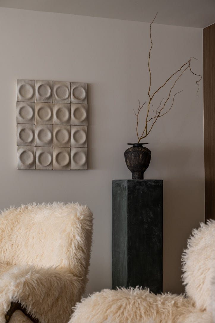
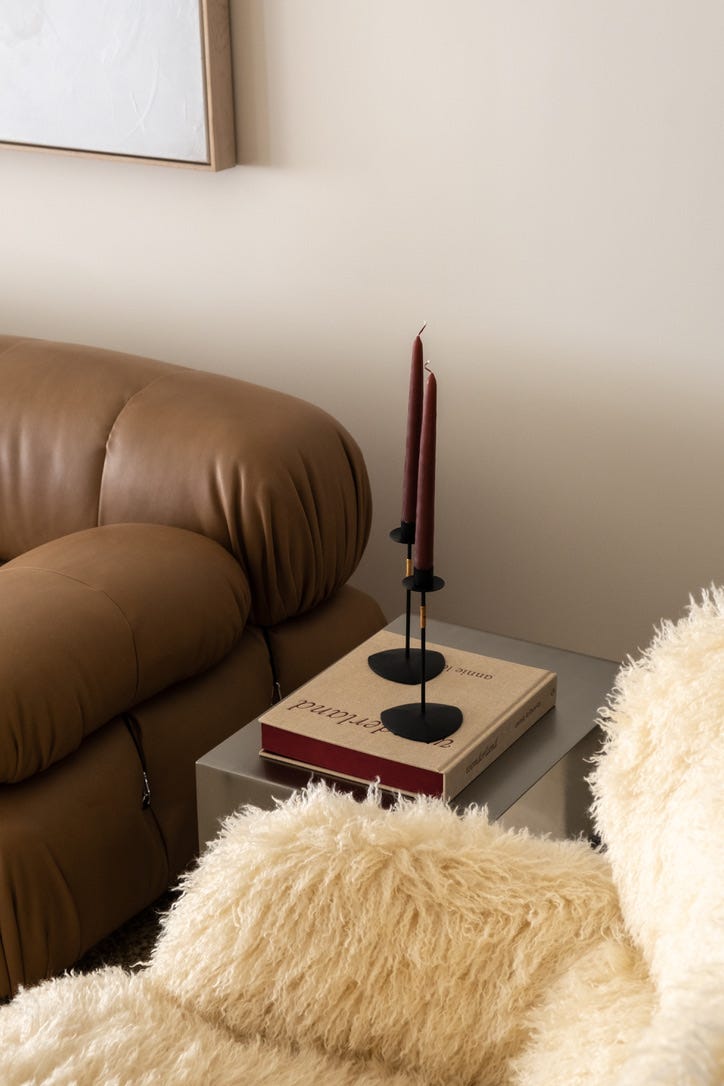
JR: That's always the fun part, adding in those touches that make it feel complete and a home. In this space, we really celebrated artists, with many custom commissions throughout the home so when it came to ceramics we focused on local LA artists we shopped as well as books that referenced design and architecture - an interest for you. I like to use books that are not only beautiful covers but that are relevant for the client. I also love a baby color pop moment because most of the main tones were timeless neutrals, the little layers at the end also allow for future flexibility in the years to come. This red pillow brought a rich drama element and was just a fun little touch. Another fun layer added in was the pedestal in a custom Portola green toned plaster featuring a beautiful aged vase with a branchy element to provide height and depth in tone!
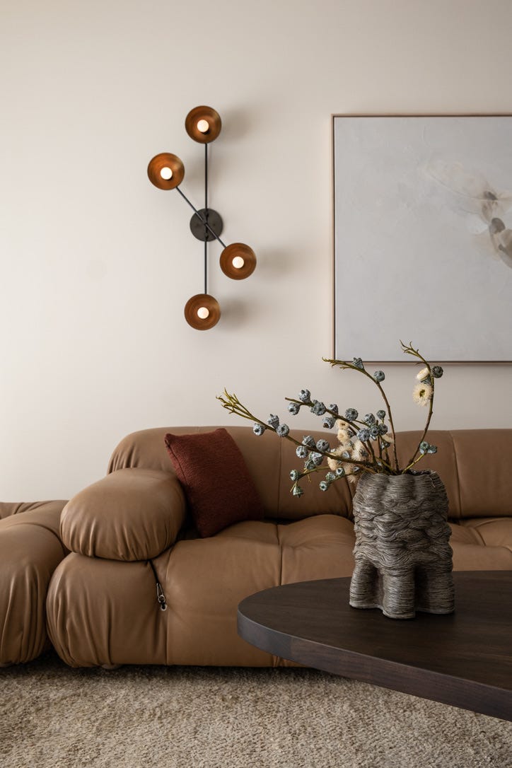
JZ: The irony of that beautiful burnt red pillow is that I started off the project saying that I dislike the color red and under no circumstances would I want it in my home. Then when it came time to add the finishing touches, it felt like that pillow color was the only intuitive answer in order to add contrast and interest. It’s amazing how a space will sometimes give you the answers as the final decor comes together. Transition State is an absolute genius when it comes to styling, so the smallest of details were the elements of magic that feel especially perfect.
A special thanks to Jenna Rochon and the Transition State team for the beauty they create and their willingness to reflect on this project. If you’re interested in working with Jenna in the future, check her out on the Expert and on her website. If you’re looking to follow an inspiring instagram account for beautiful interiors, follow Transition State there.
x jz
Images | 1 - 9 | Olivia Philo via Transition State